Brand Study on
NEW YORK ISLANDERS
New York Islanders
Brand Study

![]()
I’ve been thinking about this thing for a while.
How can you take a brand with a legacy of a lifetime to the stage where it remains modern yet iconic. Let’s be honest – NY Islanders logo is terrible. There have been few attempts on the Islanders re-branding, with the mid-1990’s being the most courageous, but still falling way short. But how can a brand successfully cycle back, learn from, and capitalize on their long lasting identity in a fresh way, while keeping Long Island fans satisfied? For last few years the Islanders have been bouncing back & forth from Nassau Coliseum to Barclays Center, but now they are close to moving into a new home – Belmont Arena , which is a great opportunity to start a new era and take advantage of City of New York as a design foundation.
![]()
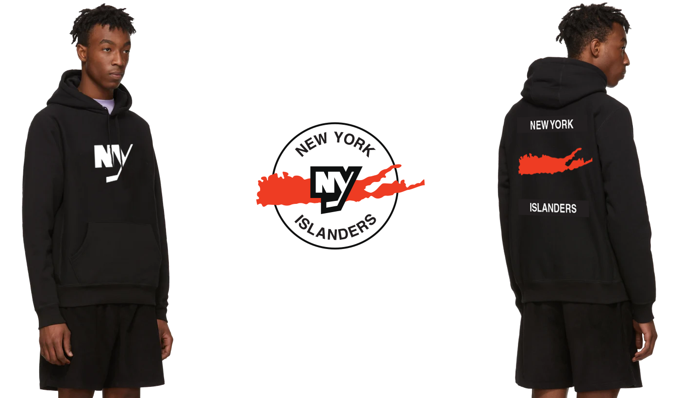
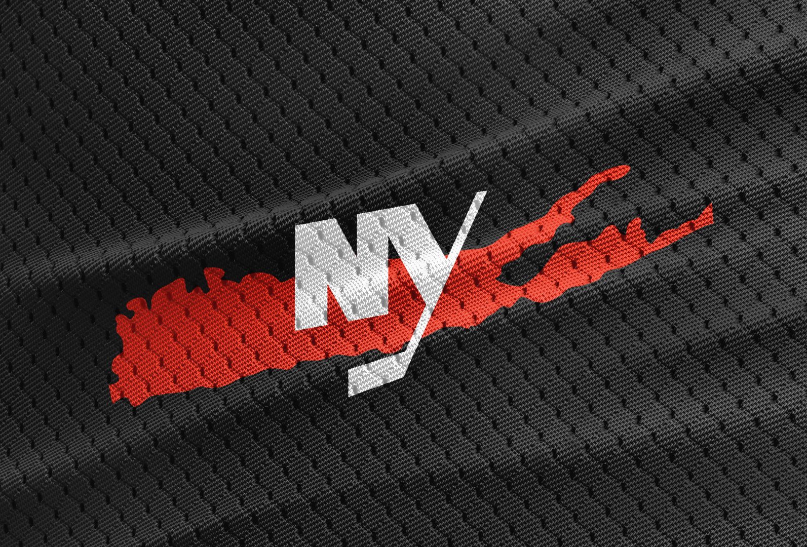
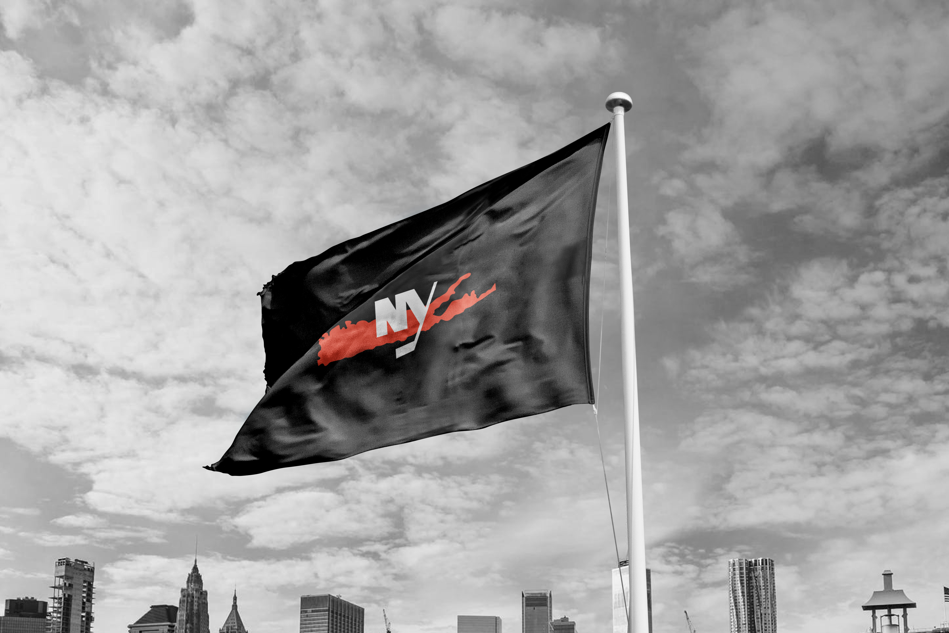
Logo exploration process –
Enhancing the fan favorite Long Island shape and iconic black & white theme from NYC wayfinding
![]()


![]()