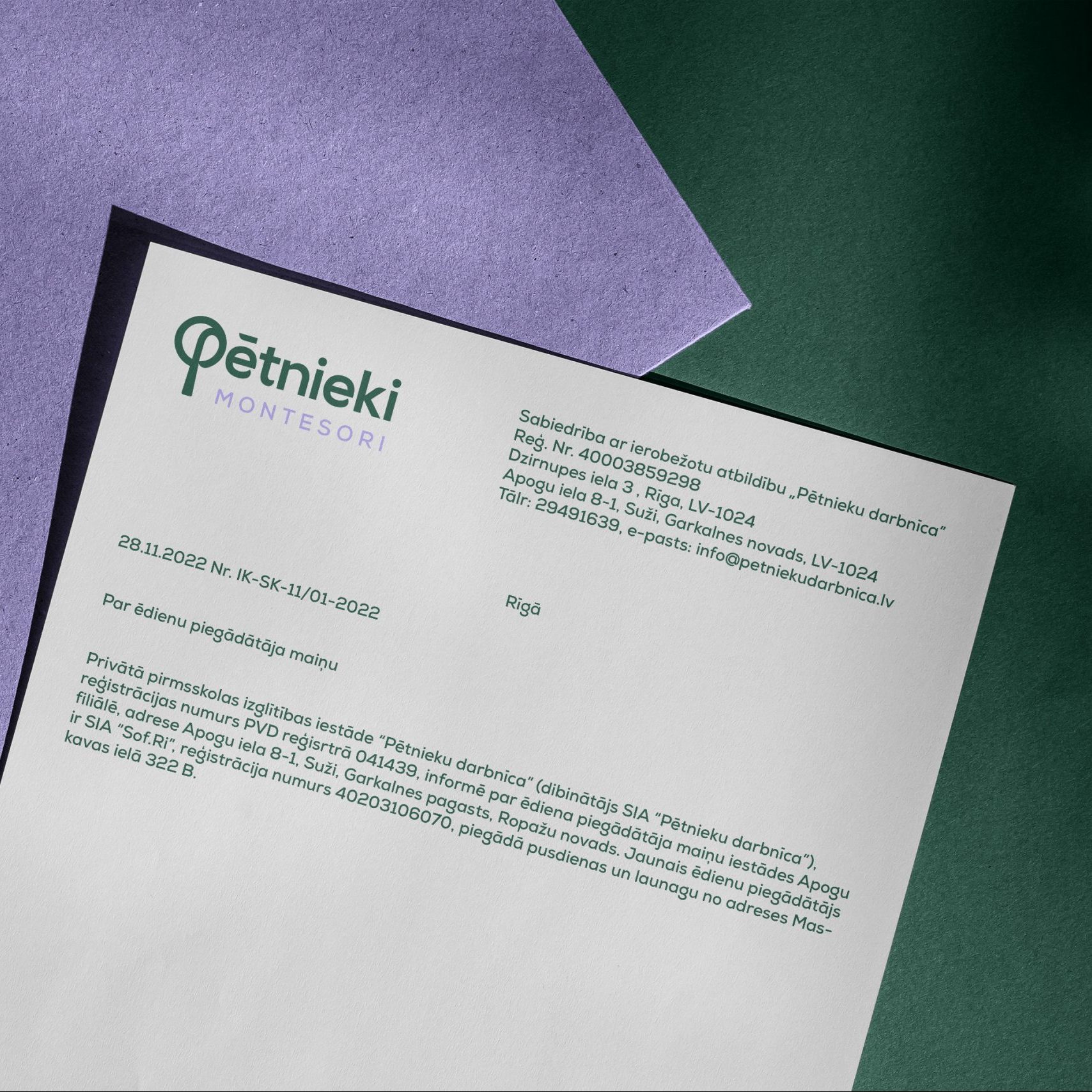
Pētnieki –
Montesori School
The identity design of Pētnieki is a harmonious blend of nature and freedom within limits.
My aim was to create a visual language that not only represents the school’s philosophy but also resonates with its diverse community of passionate educators, curious students, and engaged parents.
Logo, Brand Identity, Web

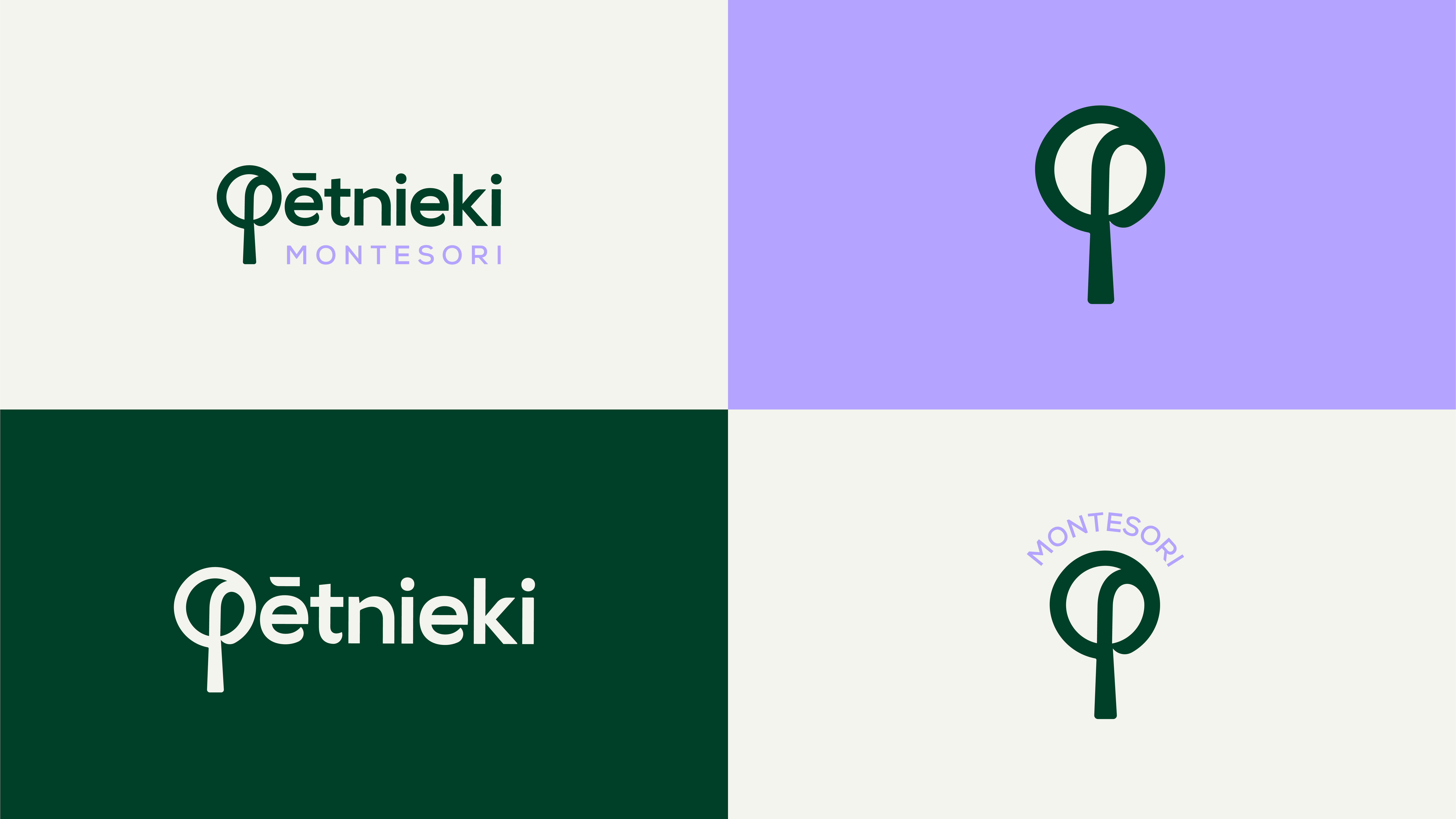

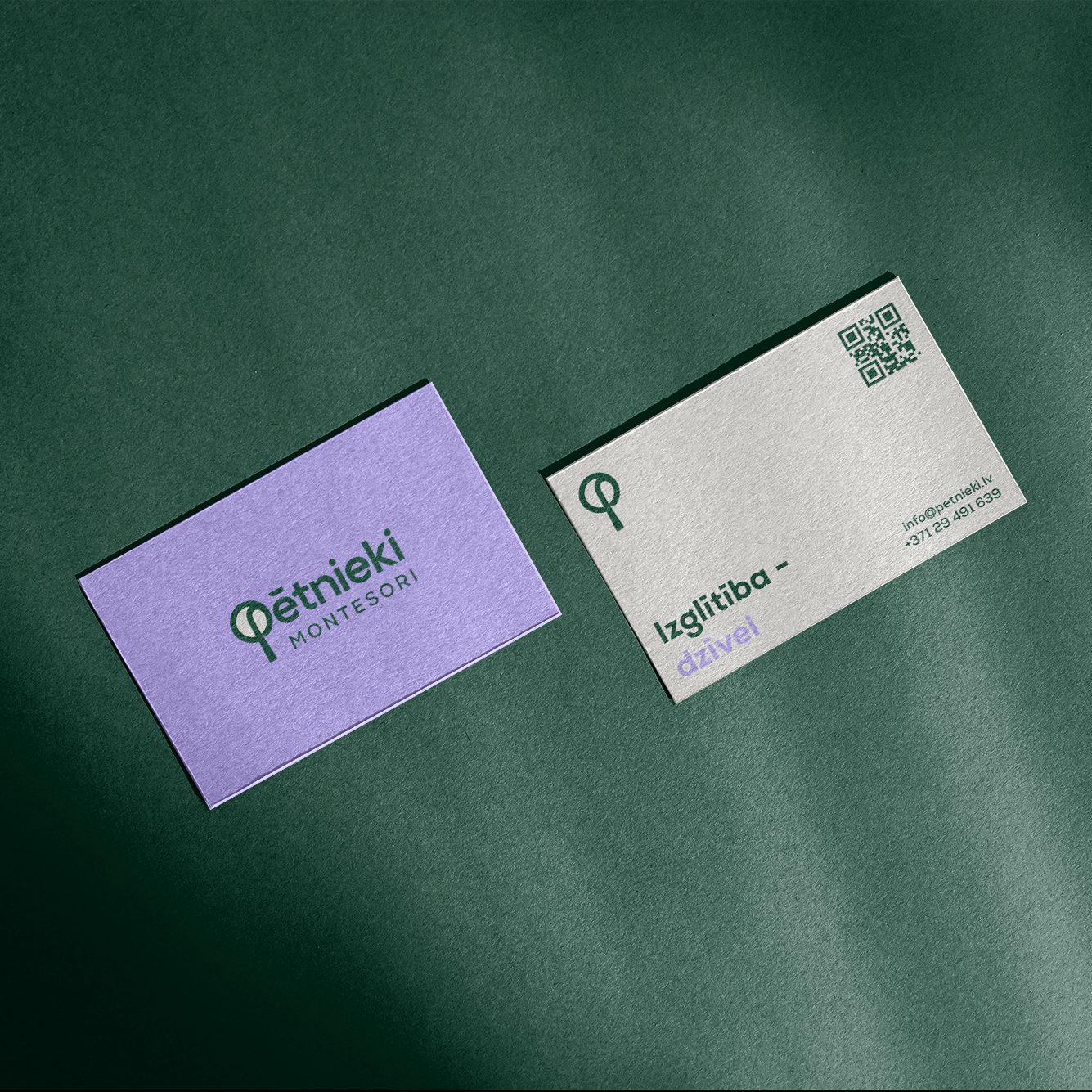
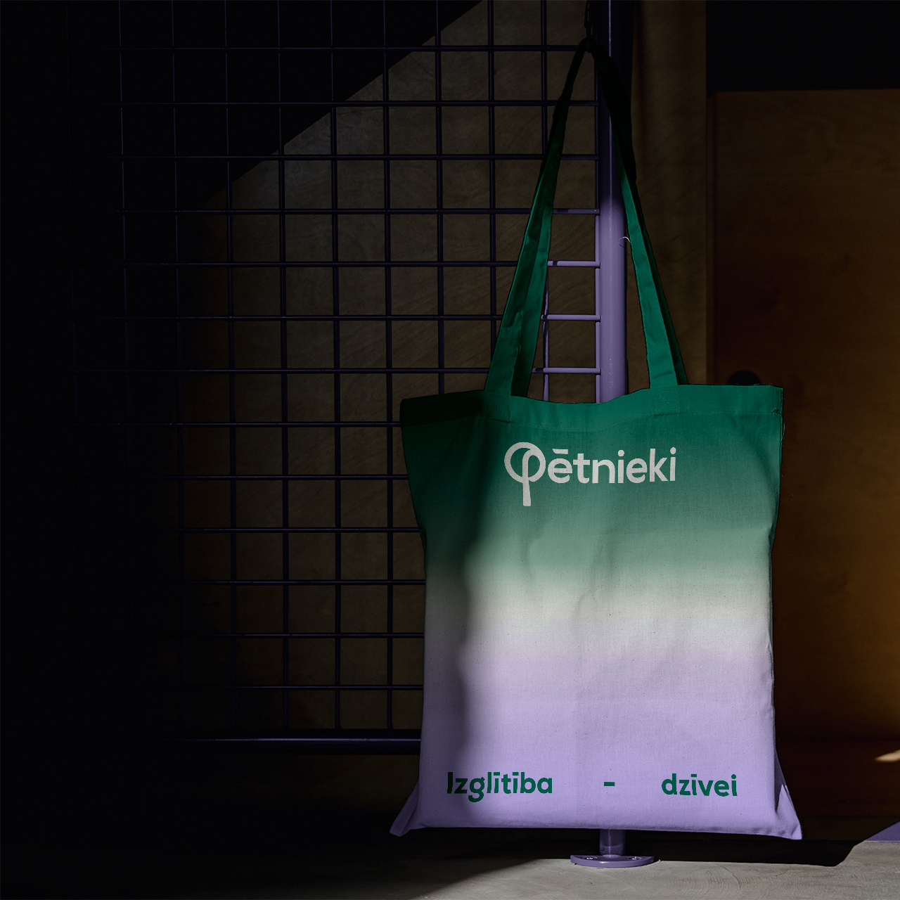
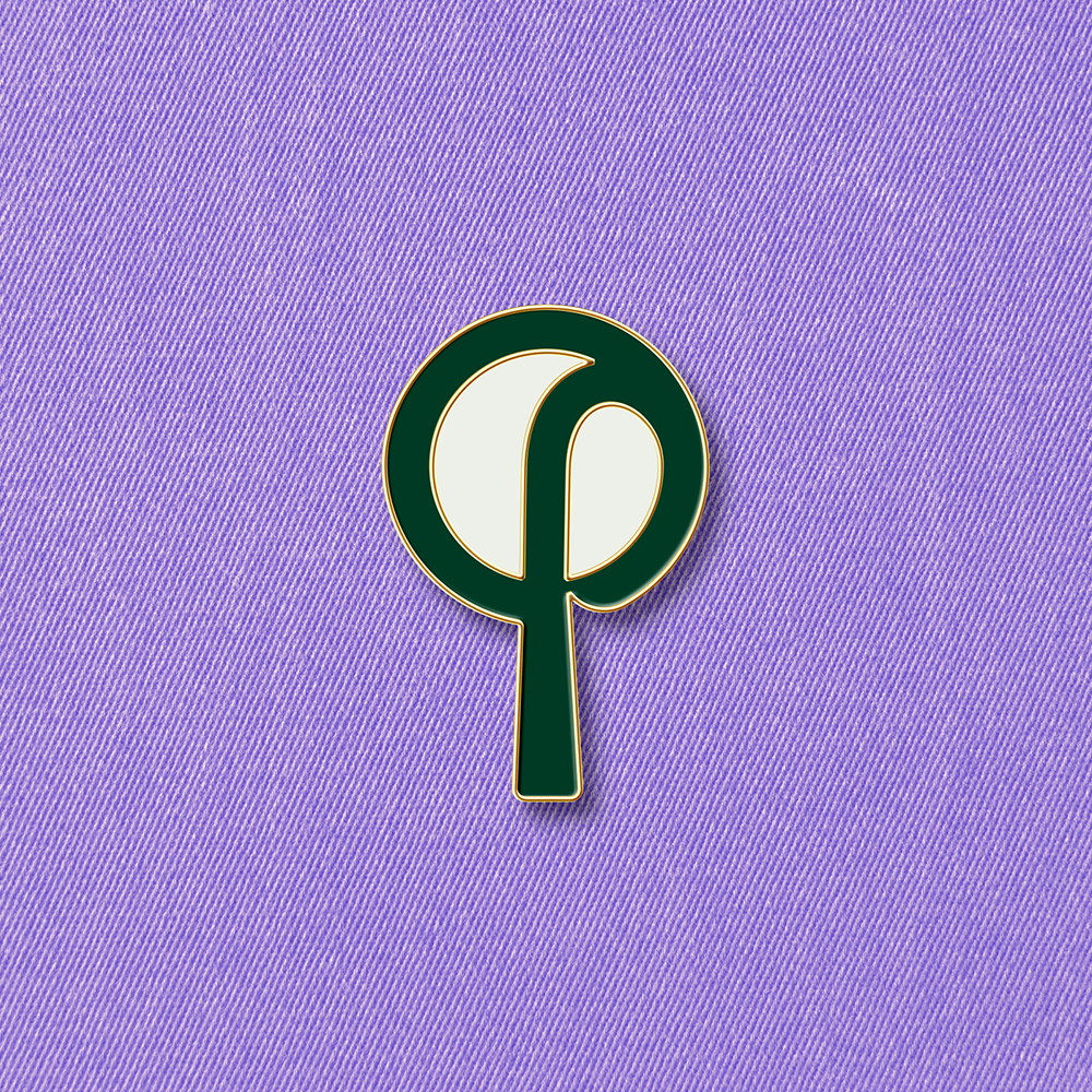
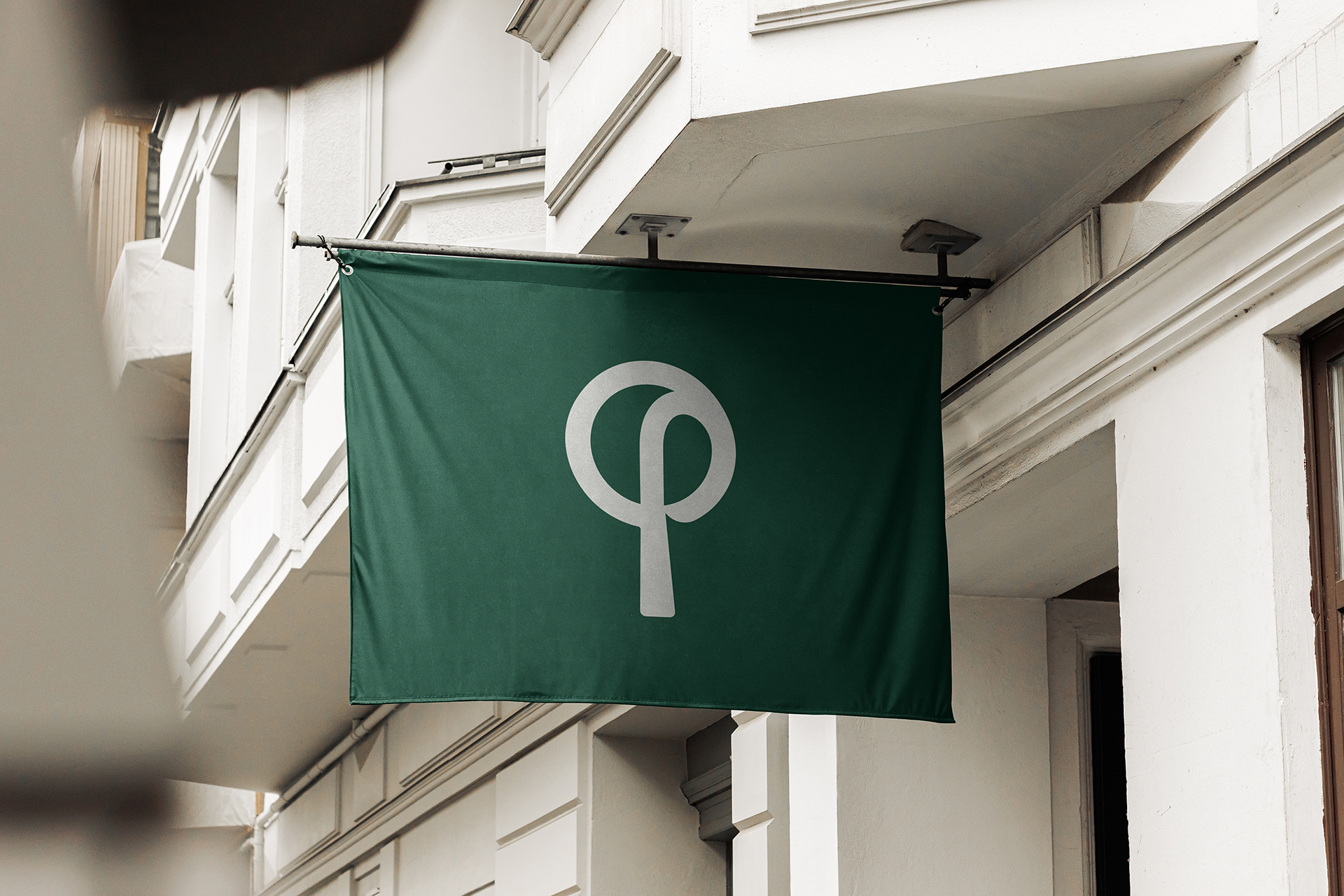
Pētnieki (Explorers) symbol is a “P” monogram that derives from universal search icon –
carrying explorer meaning and tree plant – symbolizing the earthly and close-to-nature Montessori philosophy.
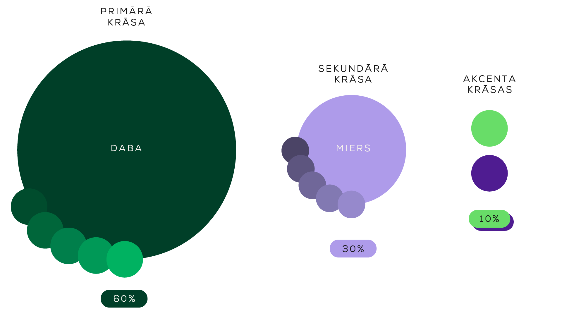
“Petnieki” primary color is deep green that represents Nature as a part of montessori method – nature enriches the life of each child by supporting physical, social, emotional, and cognitive development.
By increasing a child’s interactions with the natural world, Montessori guides and Montessori parents are promoting the child’s development as a young naturalist.
Secondary color represents harmonious environment that “Petnieki” provides. Harmony follows the Montessori’s education method which calls for free activity within a “prepared environment”, meaning an educational environment tailored to basic human characteristics and to the specific characteristics of children at different ages.